project
branding / visual identity
client
HOC
hotel online consulting
year
2012
HOC branding
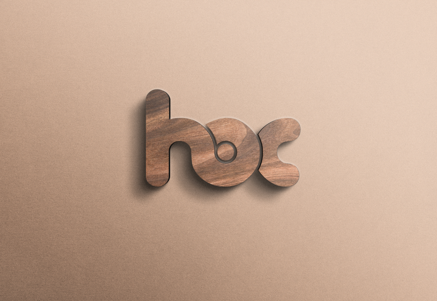
The HOC logo features a sleek, minimalist design composed of the brand’s three core initials. At the heart of the visual identity is a central dot inside the letter ‘O’, which represents a digital focus, precision, and a central hub for online hotel consulting. This clean typography communicates professionalism, strategic clarity, and a modern, results-driven approach to the hospitality industry.